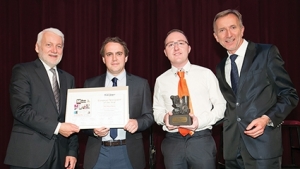
Introducing the Man behind the New Georgia Today
Georgia Today sat down with Kevin Loftus, Head of Design and IT at The Mayo News, Ireland, to discuss his contribution to the fabulous new Georgia Today design.
We at Georgia Today newspaper are very excited that our rebranding was carried out by the winner of such an extremely honorable nomination – the Best Local Newspaper in Europe! Please tell us a little about your background and how you managed to win this award?
Thank you very much, it has been an honor and privilege to work alongside such a talented team.
I guess I always had a keen interest in design from a very young age. Growing up I would always be sketching and destroying my school books with designs and doodles. I studied Graphic Design and Web Development and then proceeded to work in newspaper design.
I began my design journey with The Mayo News back in 2007. I started off on work experience in February and joined the team as a part time worker that summer.
It wasn’t long until I was made a full time member of staff and I got to work on what I really love each and every day. It was from this moment on that I knew newspaper design was for me.
Tell us about the redesign of The Mayo News and The European Newspaper of the Year award?
The entire redesign process began in January 2014.
Myself and Neill (the Managing Editor at The Mayo News) sat down and discussed what direction we wanted to take the paper in.
We wanted to create something that would continue to stand out from the competition on a weekly basis. I began to compare our own paper to others, researching fonts, colors and other papers throughout the continent. I found newspapers in Ireland all followed the same format, trying to fit as much text on a page and taking the advertisers preference over the readers and this needed to change.
I wanted our artistic statement and signature on each and every page and to bring life not only back to the paper but to the entire company and I believe we have achieved this with the redesign.
We reworked the entire paper: a new color palette, new elements, introducing half column gaps of white space to separate articles and at the same time we removed a lot of the clutter that had become distracting to readers. We also added our social media and online information to the front of each section, and information boxes throughout the paper linking articles and directing our readers online, thus expanding their experience, not just in the paper but online too.
We treat the whole newspaper as one complete product.
With each issue we bring the reader on a journey. Starting with News, Notes, Sports and then on to Living. This is where the real storytelling in the mind begins. We have such an array of talented writers and it is my job as a designer to visually portray the story to our readers. The design of the paper is responsible for this entire journey.
Browsing through pages is the readers experience and we want them to enjoy it each step of the way. We treated most pages as a spread, because this is how readers perceive and view it.
We have a niche market with the local element and this information can only be got in your local newspaper each and every week.
We were honored to be given the title of European Newspaper of the Year. Since winning the award our paper has grown from strength to strength. We even have a 6 part TV series being aired in Ireland next week following our daily lives and how we produce the paper which is very exciting for everyone involved.
You met George Sharashidze, the publisher of Georgia Today, in Vienna at the European Newspaper Congress. What was your motivation to agree to work with him on the new Georgia Today?
From the moment I met George I knew we would end up working together. He has such a passion and pride in the newspaper, which is very evident. I really like to meet people with the same passion for design and positivity as myself. We both knew from the start that we were reading from the same page (no pun intended). The size and shape of the Georgia Today newspaper was one which I had never worked on before so I was keen to get on board with this project.
How do you feel it has turned out?
I’m very happy with the new layout. I think the readers will really enjoy it. The paper is now a clearer and cleaner publication, while maintaining its high standards. My aim was to create a brighter and more colorful paper and I believe we achieved this. I believe the future is bright for Georgia Today.
To read more about the Georgia Today rebrand, click here.
Katie Ruth Davies


